Gap Changes Logo Back After Online Uproar
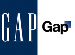
Your logo is your face in the marketplace, so when it comes to redesigning your business logo, several factors should be taken into consideration before making any alternations or it might negatively impact your business. Gap found out the hard way when they changed their well-known logo to a new design with Helvetica style lettering and a small, off-centered blue box. This move was their bid to stay relevant and create a contemporary presence in the marketplace. But Gap’s customers weren’t happy with the new design and their displeasure could be seen and heard online. The uproar was viral. Even though the Gap team initially defended their decision to change the business logo, not even two weeks later went by before they changed the logo back to the old design.
Even successful companies make mistakes, but you don’t have to make that same mistake. This is why when choosing to improve or change your logo you must consult the best, since the wrong decision can leave customers feeling marooned. At J.M. Field Marketing, our creative team is experienced at updating or redesigning a business logo to better appeal to your target audience. We understand the importance of creating a fresh and innovative look to attract potential clients, while maintaining the image you already have.
I do agree th at in order to remain relevant in a market that changes in a blink of an eye, one must make the necessary changes but the change must be accepted by your target audience or else you will do more damage than good.
Gap quickly realized they had taken the wrong approach to their logo redesign and began to seek customer input. They used their social media platforms to find out from fans and followers how they wanted to see the Gap logo redesigned and even started a Gap Logo Redesign Contest. By opening the doors of communication, this national retailer was able to engage their customers and fill the communication “Gap.”
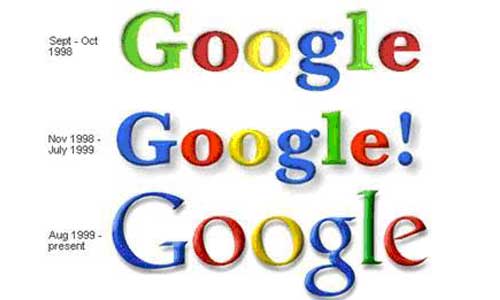
Another option Gap could have chosen was to have their logo updated instead of a complete redesign. Google has done this in the past and we rarely notice it because the alternations are minor ,while at the same time keeping their logo fresh and contemporary.

A logo is an ambassador for your brand and influences how current and potential customers perceive your business. With a strong logo redesign, you can make the right statement and get people talking positively about your business. Ask us how, by contacting us today!
By Tavia & Sean 954-523-1957
